Friday 22 January 2016

Poster and Digipak Process - Font and Colour Tests


In order to find some possible fonts to use for our digipak, we looked at the website 'Dafont.com'. As the overall theme of the band is very grunge like, we looked at the Distorted section to find lots of possible fonts we could use. We typed in "Unnamed" in the search bar to see what it would look like. We decided on "Slave Only Dreams To Be King" as this font worked well with the font of the band's logo, and so I thought this linked well.

We then looked at different colour tests we could use. For the poster, we included the 'Grind' logo again at the top, to keep the regular pattern of the band's name. We tried different colours for this to see if it would look better if we made the colouring a little different. We tried this with the colour white, only to find that it stood out a little too much and made the poster look a lot more brighter. I found that this took away the constant theme of dark colours and found it didn't really fit in, so it looked a lot more professional to keep it black and keep it looking darker.

Digipak Creation Process

For this process, we used a simple editing app 'Fotor', and took the original images taken on a Canon Camera, and used the effect 'Scratched', in order to help brighten up the image and add a scratchy effect to the image. By using the Canon camera, we were able to get the band member into focus, and we then blurred the image of the background of the dock just to give it a blurred background. This is the before and after photo:


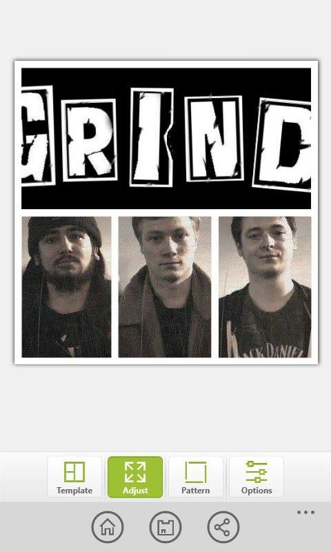
We then continued this trend of 'Scratched' images across the three band members in order to keep up the theme of the band, for the poster as well as the digipak. We then used the same app, "Fotor", in order to create the layout of the digipak. We put the three photos of the band together and the logo together in a collage.


After we created the layout of the digipak, we then put the collage image into Adobe Photoshop, extended the image and added some custom font from "Dafont.com". We used the font 'Slave Only Dreams to be King' as it looked very grunge like over the other fonts we looked at. From there we then added links to the bands Facebook Page, Soundcloud and Official Music Video in order for the audience to find their music easier.


Wednesday 13 January 2016

Ancillary Task, Poster (Final Draft)

We decided to go for our second idea by taking close ups of the band members separately and adding the band's logo. We have also included Facebook, Youtube and Soundcloud links.

Sunday 10 January 2016

Feedback

This is the feedback we have gained for our music video and first draft of our poster. The feedback is mostly positive in regards to our music video (look at Feedback for our first draft of our music video). We have yet to finish our digipak, therefore so far we have no feedback for this. However for our poster for improvements, I think we are going to re-shoot photos as the photos we currently have are not that clear. I also think that because of this, we are going to go through with our backup plan of taking pictures of the band separately, as taking pictures of the band themselves will probably work better in helping to promote the band.

Thursday 7 January 2016

Ancillary Task, Digipak (First Draft)

This is our first draft for our digipak.

The back of the digipak:
 The digipak CD:
 The front cover:
 The inside of the digipak:
 The spine of the digipak:

Wednesday 6 January 2016